Core promise
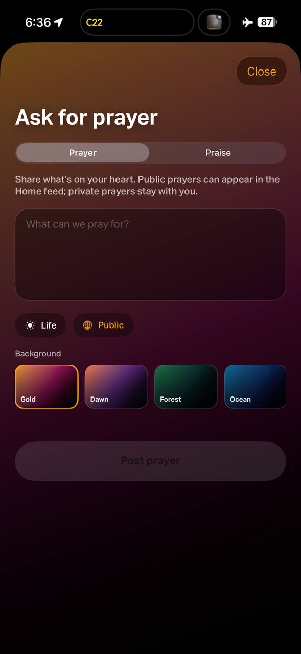
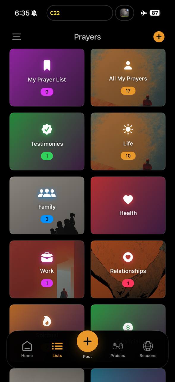
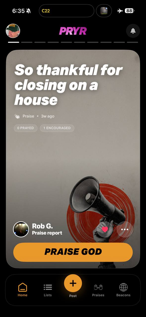
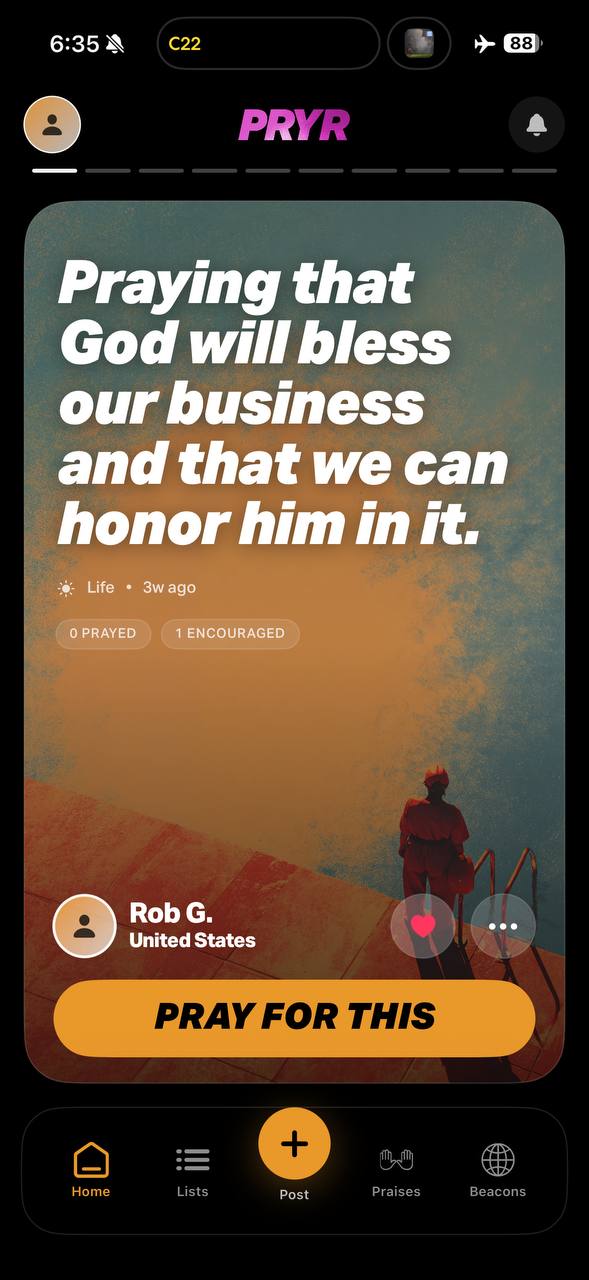
Believers can share prayer requests, pray for others, follow prayer journeys, and see what Christians are praying about in real time.
PRYR is the Instagram of prayer.
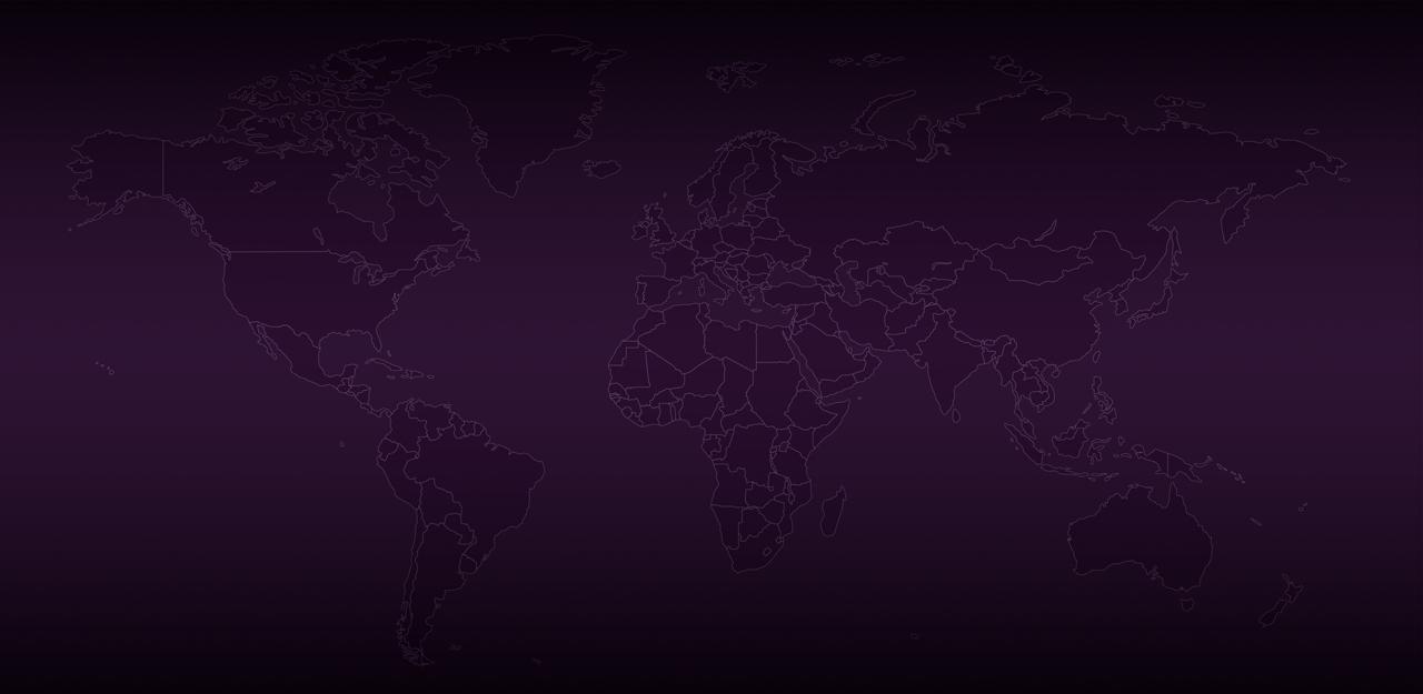
The public brand should feel global, immediate, spiritually grounded, and useful: a place to share prayer requests, praise reports, prayer journeys, and live prayer activity around the world.
PRYR is a Christian social prayer platform built around one public promise: Never Alone. The experience should feel warm, alive, global, and spiritually serious without sounding performative.
Believers can share prayer requests, pray for others, follow prayer journeys, and see what Christians are praying about in real time.
Confident, clear, reverent, human. Use direct language. Avoid internal art-direction lines and anything that sounds like a costume.
Build faith, celebrate God’s faithfulness, share burdens, and remind users they are never alone.
Archivo carries the impact. Bitter carries the warmth, prayerful body copy, and longer reading moments.
Hero lines, navigation, buttons, labels, product statements. Prefer heavy italic weights for energy and recognition.
Paragraphs, legal pages, statements, faith language, and calmer explanatory copy. Grounded and readable.
A dark cinematic base with cream warmth and prayer-beacon accents. Pink is the signal; gold and white create variation in the live map system.
Use a layered iPhone cluster on the hero. On hover, the screens splay outward quickly using .275s ease-in-out, then return on mouse-off.
Keep screenshots large, dimensional, and slightly theatrical. They should feel alive, not like static product thumbnails.
Hover splay should be quick and subtle. Movement supports delight; it should not fight the headline.
Stack copy first, screenshots second. Scale the cluster down instead of hiding the product.
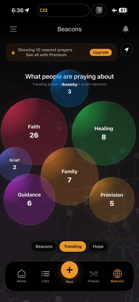
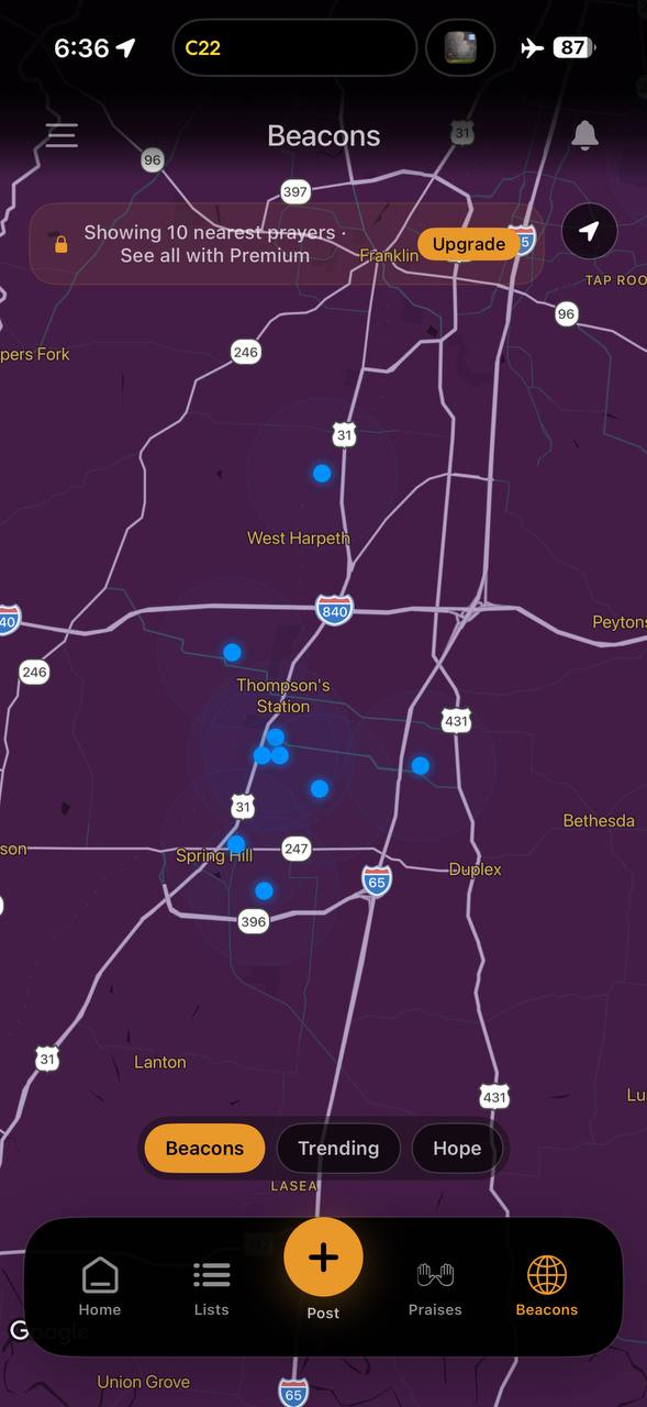
Public copy should lead with clarity. The brand is bold, but the promise is simple: prayer requests, praise reports, prayer journeys, and a global map of believers praying in real time.